One of the things I love doing whenever we cover a movie here at the Cult Film Club, is to dig into the visual ad campaigns for the films. I love it when a film has some variation to how it was marketed, so either the studio was trying to flank the audience, or the film needed to be sold to different audiences in different ways. And now that we live in an era where literally everything is online, it’s so much fun to scout out these variation, or foreign versions of movie posters and VHS covers.
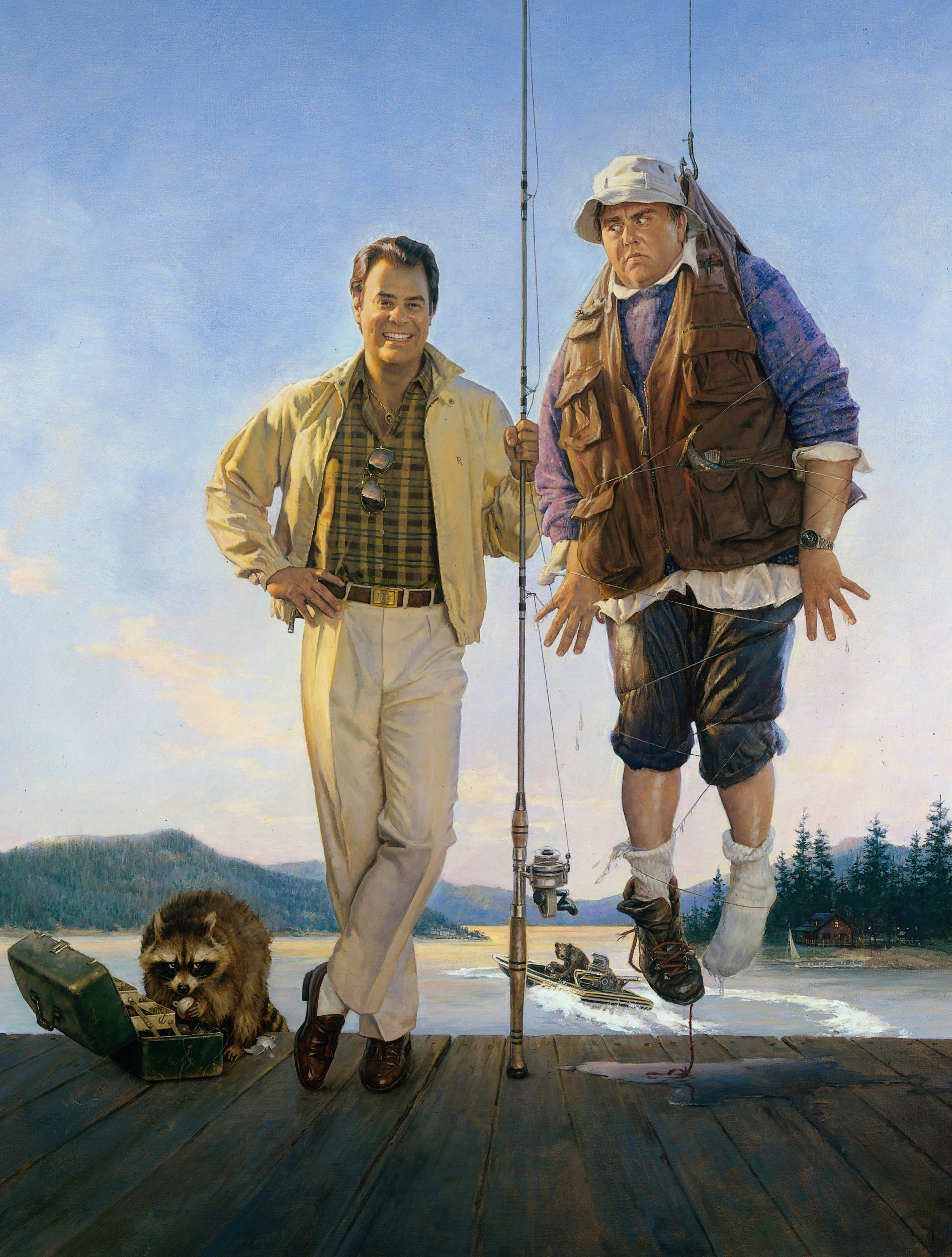
In the United States the movie had a fairly focused visual marketing strategy that centered around the slapsticky image of Dan Aykroyd’s Roman landing the big one in John Candy’s Chet Ripley. The poster art features the two as if they were on the cover of a magazine complete with volume and issue numbers, credits listed as article titles, and even a UPC symbol to seal the deal. There’s a lot of fun stuff crammed into the artwork from the Bald-Headed Bear of Claire County riding in the “Suck My Wake” speedboat, to Roman’s monogrammed belt buckle.
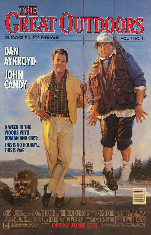
You can see this much clearer in the original painting below. I wish we could identify the artist, but no matter how much I’ve dug I can’t seem to identify who he or she is. One of the things I find fascinating about this painting is that the artist provided the studio with some interesting variations that they could utilize in the marketing. If you check out our piece on the Newspaper ads for the film there is a version of this painting that was altered for seasonal patriotism on the Fourth of July that included some fireworks and a flag mounted on the fishing pole. Though I’m sure those weren’t added by he original artist, what I found even more interesting is that there was a different image of the Raccoons on the dock as well as the addition of a package of “L&A Hot Dogs”, the L&A standing for Lips and Assholes, a very memorable line from the film. These elements appear to be paintings, not just added nonsense, and it makes me wonder if the artist provided them beforehand for variations.
I’ve also noticed that the section of the painting featuring Roman and Chet was also repurposed (a lot) in other marketing for the film over the years. Take for instance the Blu-Ray cover that was just released recently. That section of the painting was paired with a different painted background (as well as some photo manipulated grass in the foreground) to create a slightly more authentic look. I say more authentic because the cabin that was painted in the original artwork doesn’t look anything like the cabin that the Ripleys rent for their week in Wisconsin. But the painted background on the Blu features a cabin much more in line with what you see in the film…
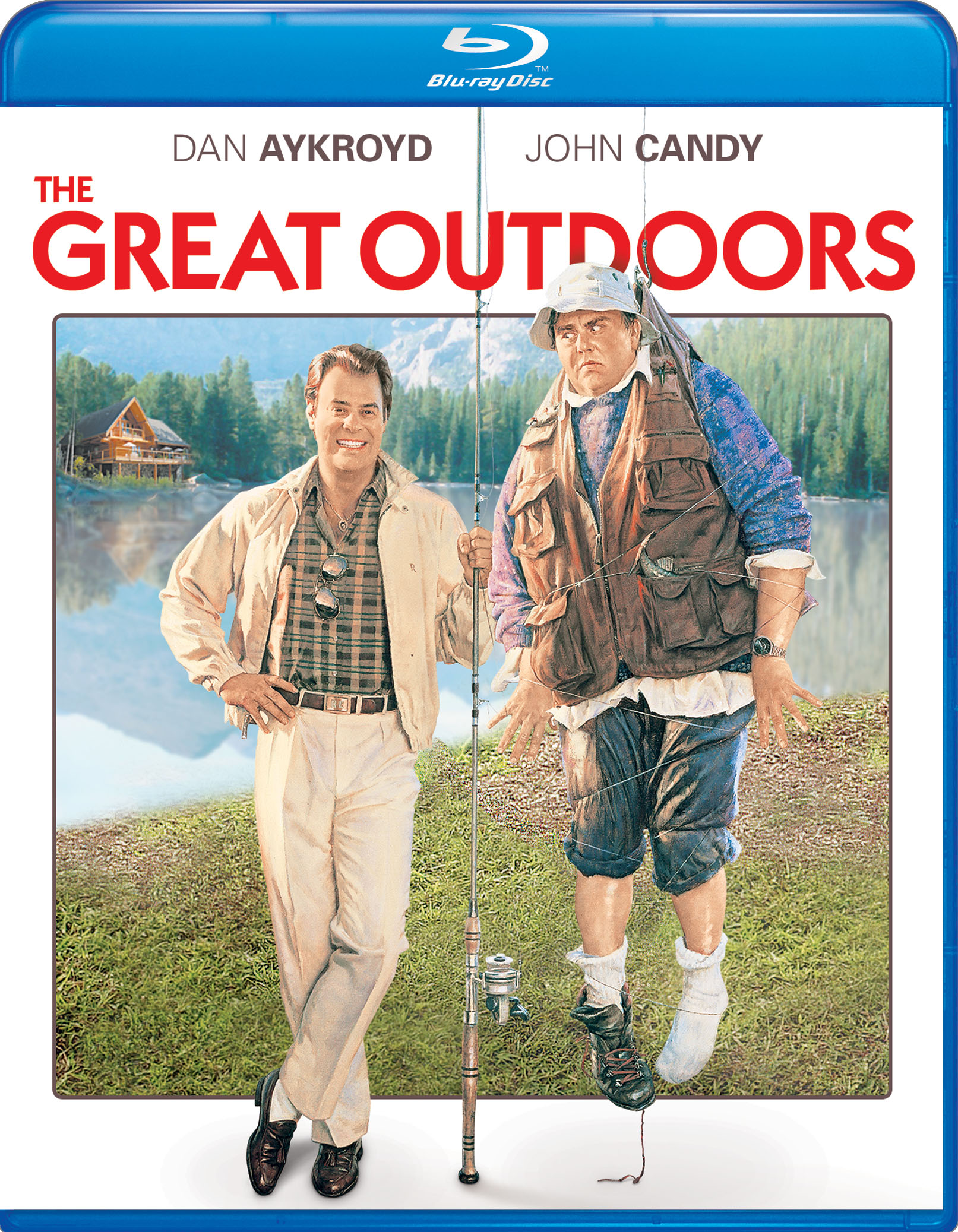
Of course this background painting (as well as the photo of the grass in the foreground) were actually swiped from the super-shitty DVD cover of the film that was released a long time ago. It’s kind of quaintly hilarious how bad most DVD cover art is, and how long we as consumers put up with it over the years. Lucky for film fans that Blu-Ray discs tend to have better covers that largely feature the original movie poster artwork, even if it sometimes is altered like in the case above.
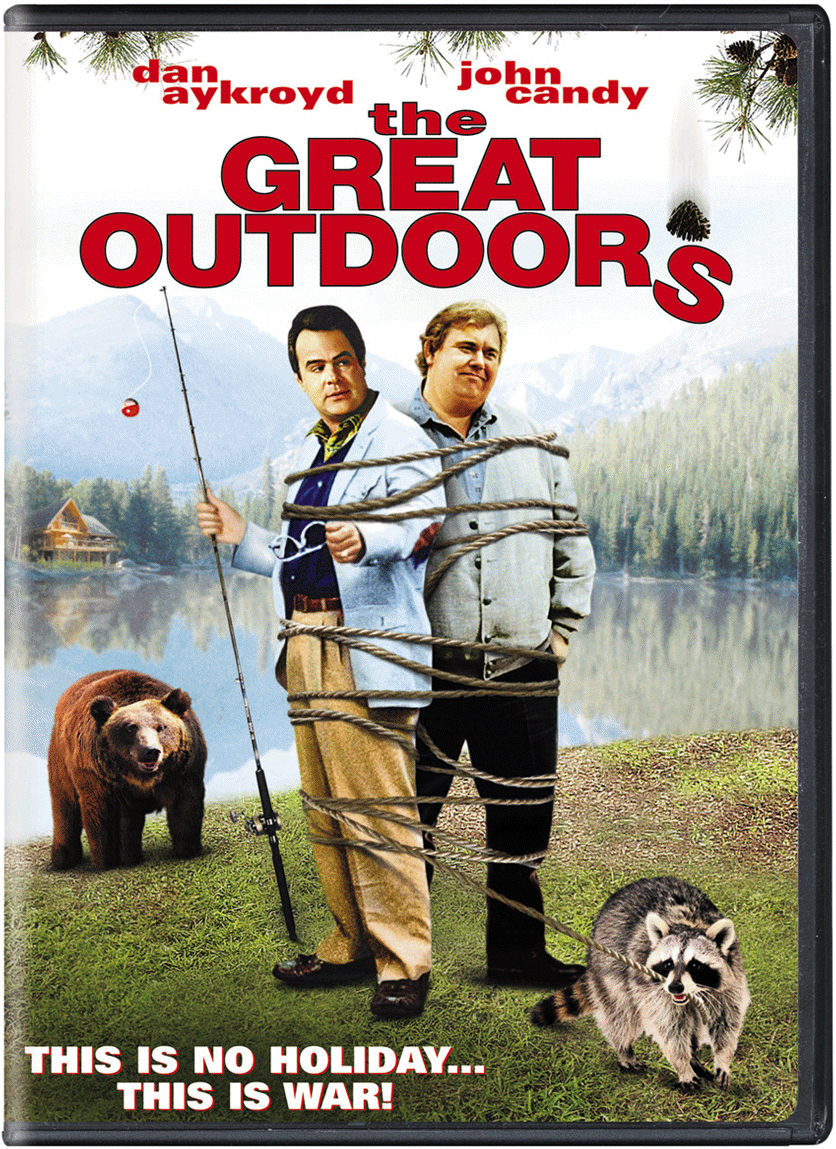
Bu the Blu-ray wasn’t the first time that the core portion of the original poster artwork was re-used. Take for instance the cover to the German VHS release which features a re-touched version of the original two figures, though now being stalked by the bald-headed bear from the film. For some reason this German artist chose to keep the original raccoon, but changed the location to the lakefront sans dock, so they’re all standing in the mud. They even added Chet’s missing boot. Such a weird piece…
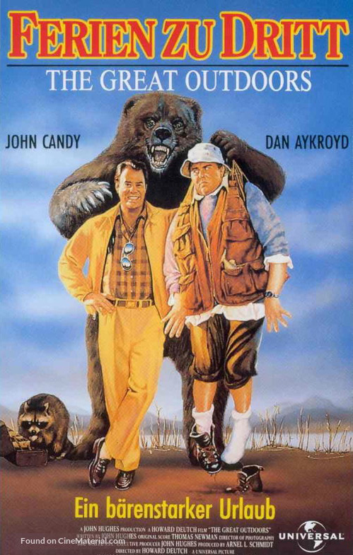
But it’s not the weirdest variation by a country mile. That award goes to the Japanese poster for the film that needs to be seen to be believed!
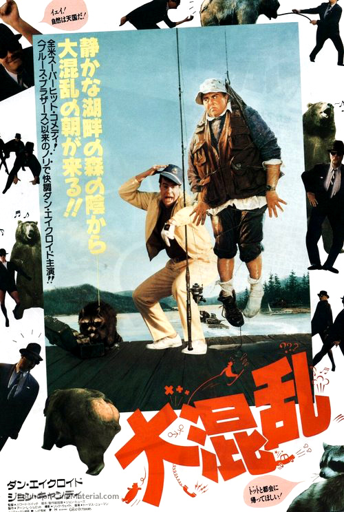
I just don’t know where to start with this one. Is it the focus on the spoilery balding of the bear’s butt? The inclusion of 8 or 9 images of Elwood Blues, framing the picture and dancing with said bear? The fact that they ditched the painted image of Roman in favor of the gap-mouthed image of Aykroyd from the driving range scene? How about the fact that the Kanji logo for the film incorporates a water skier, a car crash, a saxophone, a bear sliding, a phone ringing off the hook, ad the male and female sex symbols for good measure? I haven’t even gotten to the fact that this is the first poster that accurately features the talking raccoons…
