One of the cool things about looking back at films from the 80s is that typically there’s a wealth of cool and obscure marketing artwork for practically every single movie, regardless of budget or popularity. Cinema was truly at a peak during the decade and because there were so many films being released the studios put a lot of time and effort into selling these flicks. It was common that productions would commission multiple artists to paint gorgeous poster artwork for the US market, as well as new pieces for foreign markets as well, and so it was common that a film might end up with five to ten different posters. For cinema fans this is a treasure trove of riches and for collectors it’s fun to try and track down all of the various permutations of the one-sheets.
The Dark Crystal was no exception, and the folks at Henson Associates and ITC Entertainment would end up commissioning at least seven different pieces of art to promote the film. Let’s take a look at the designs that were used to sell the movie in the US, Japan, Spain, Italy and the UK, as well as a couple of pieces that never made it to print. Oddly enough, of all the artists that were tasked with creating pieces for this movie there is one notable artist that was not tapped, and that the man who created the designs to begin with, Brian Froud. I wonder why he wasn’t the featured artist? Anyway, let’s take a look at the posters we did get back in 1982.
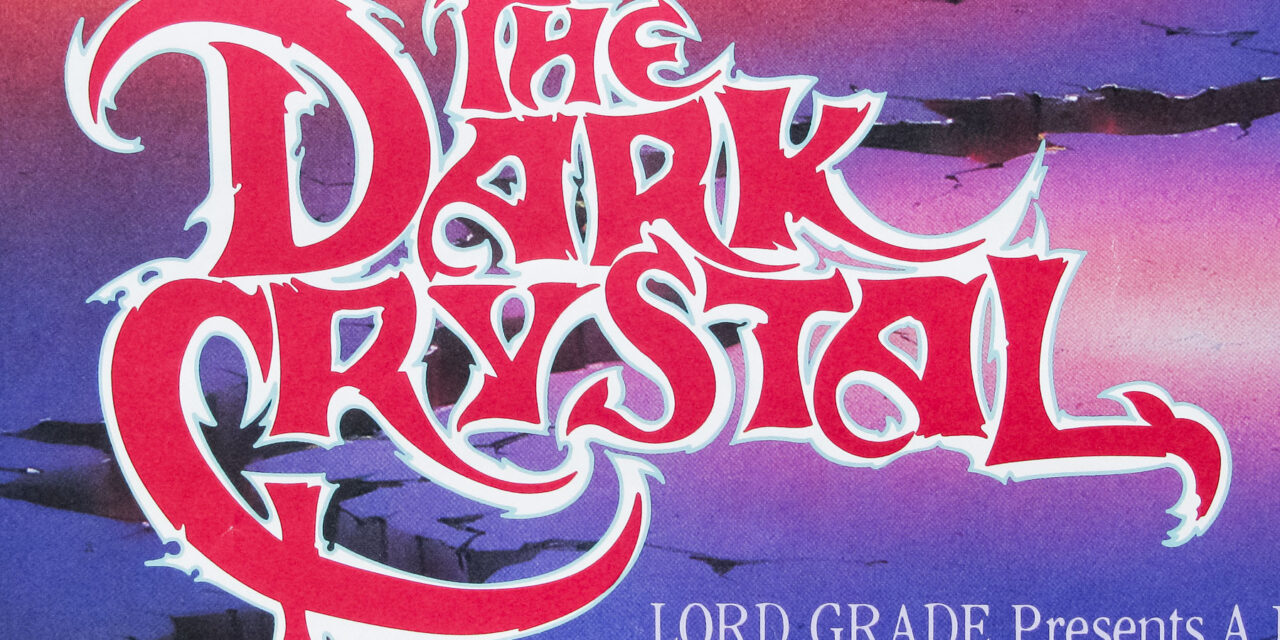
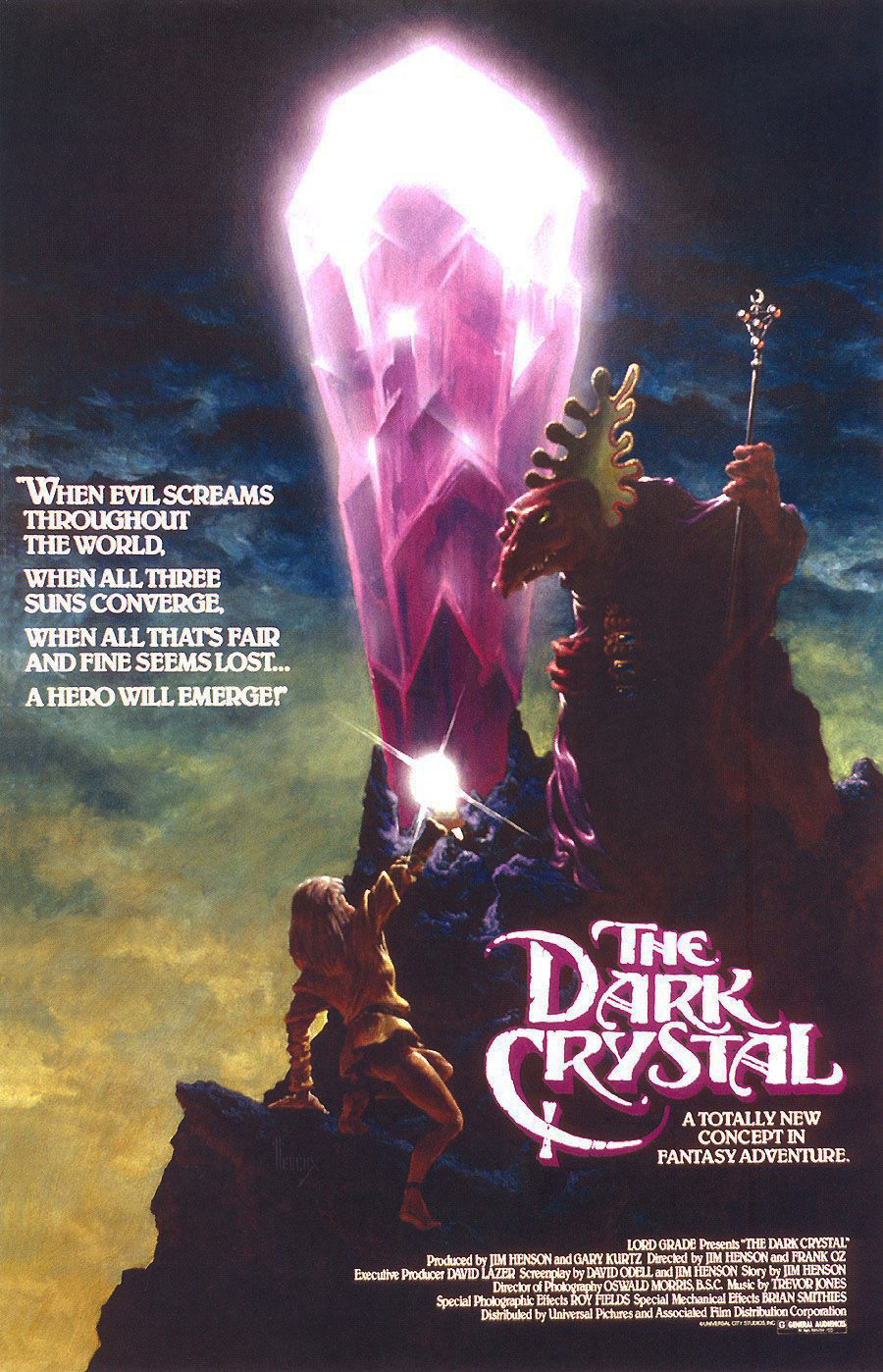
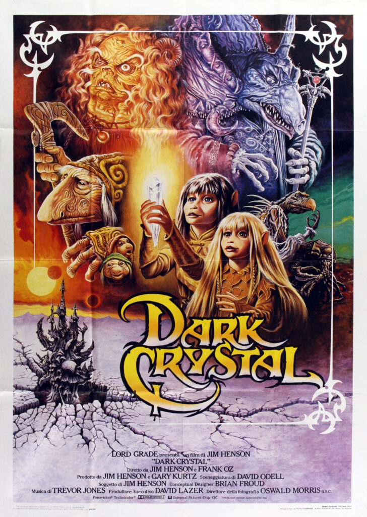
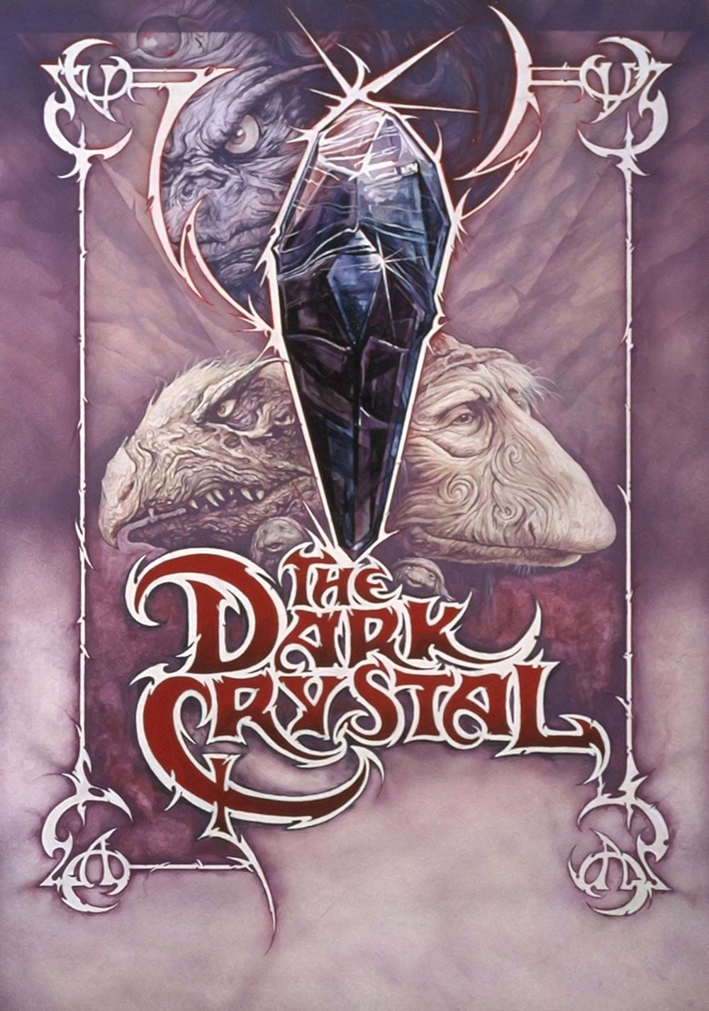
First up, let’s start with the classic US poster, the one that most of us would have seen in movie theaters and the one that eventually adorned the initial home video release of the movie.
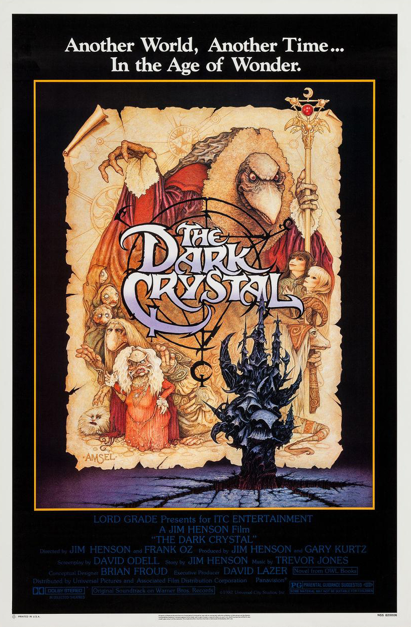
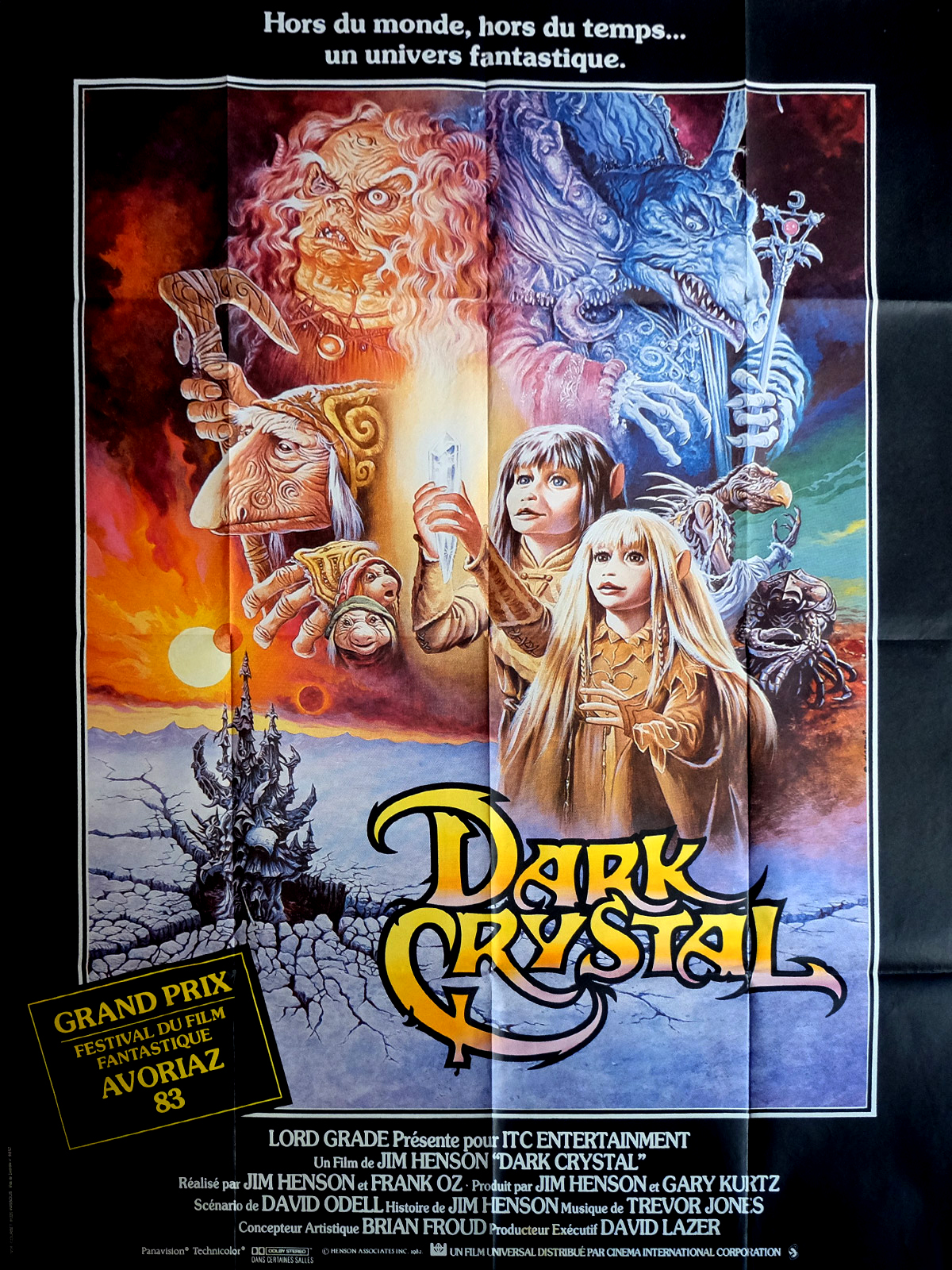
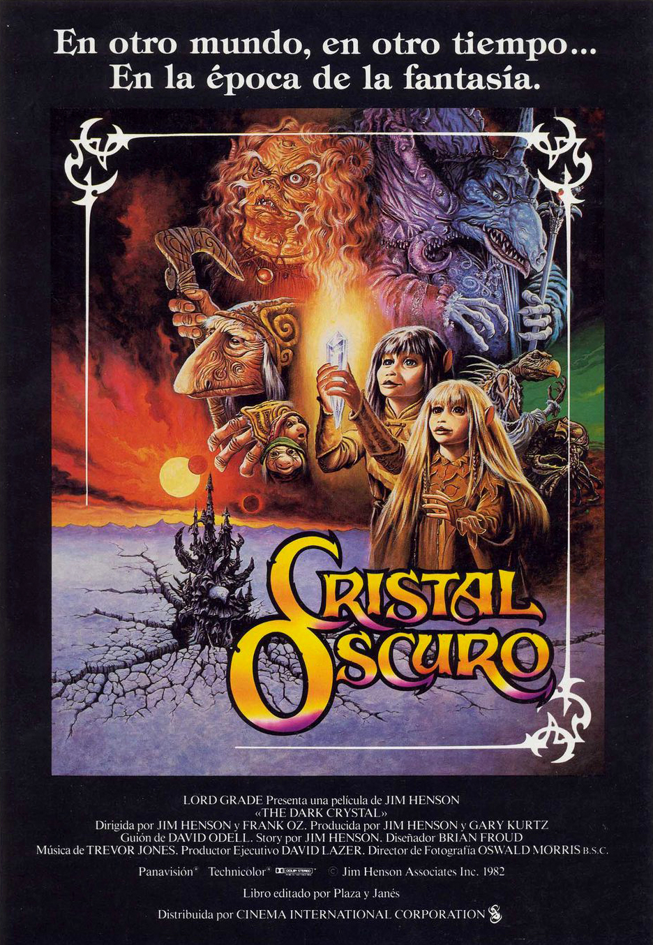
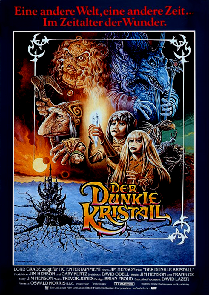
This piece was painted by Richard Amsel who is arguably most famous for creating the iconic poster artwork for Raiders of the Lost Ark, but he’s worked on numerous films including The Sting, the 1980 Flash Gordon film, Chinatown, Mad Max: Beyond Thunderdome, and one of my personal favorites, The Driver. He also illustrated the covers of over three dozen TV Guide magazines. One of Amsel’s strengths as an artist is creating iconic character collages that are framed in interesting ways. He often uses an art deco motif, but I really love the aged parchment framing in this Dark Crystal piece, even if he chose to break with the concept by having the Chamberlin’s scepter flow off the “paper”. This painting was used in a lot of the promotional material (specifically the newsprint ads), but especially when the movie was released on home video. It also popped up on the posters for the foreign markets as well, like with this UK quad poster…
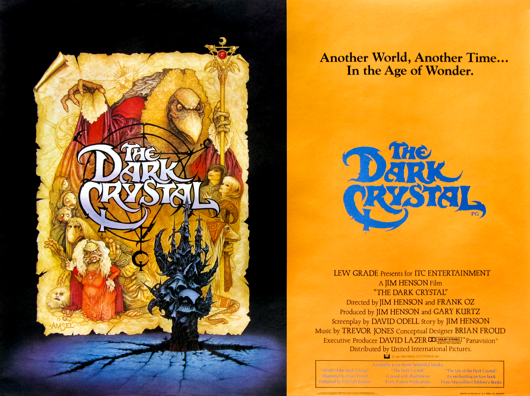
Though the layout of this quad is a little jarring, what with the two halves and double logo making it look more like a program unfolded, I do love that Amsel’s artwork is left untouched for the most part and given some room to breath away from the credits and tagline. Since he is so renowned, a lot of his process work has ended up online including the comp of the original Dark Crystal Poster!
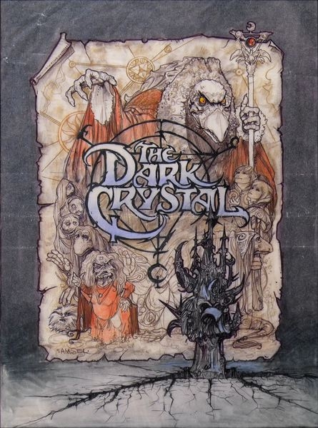
Image from Adam McDaniel’s Richard Amsel tribute site.
What I love about this comp piece, besides the fact that it’s a great piece of artwork, is that illustrates that the Dark Crystal logo was part of the overall artwork and not a graphic that was overlaid afterwards. It’s kind of rare that the artists would incorporate much text or logos in the poster art they worked on (for a number of reasons), but it’s really awesome to know that it was hand painted as a part of the poster.
Before the classic Amsel poster was released, there was a teaser poster issued that used not only in poster marketing, but also in print ads.
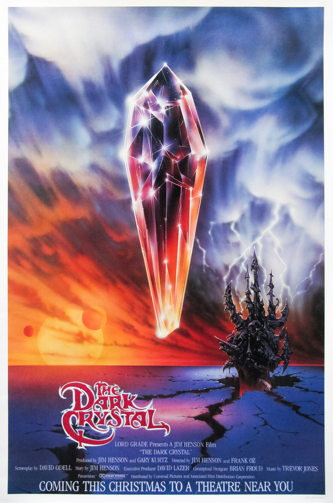
This teaser poster was painted by famed commercial artist Bob Lee Hickson. While you may not know is his work from all that many movie posters, you most definitely know him from his iconic logo design and album artwork for brands like Camel Cigarettes (he painted a lot of the Joe Camel ads), McDonalds (the Mac Tonight logo), and bands like ELO (he painted their iconic jukebox spaceship logo.) I love that this pieces focuses on the crystal and the Skeksis castle, ignoring all of the characters. Very striking. I saw this piece as ad in a million comic books as a kid.
Speaking of teaser and promotional posters, this next piece was created as a teaser image but I believe was never used in any of the marketing.
This piece was painted by Richard Hescox who has had a prolific career as a film poster artist. You might know his work from films like The Neverending Story, Swamp Thing, the Video Dead, or the home video boxart of The Texas Chainsaw Massacre. I believe that this piece was commissioned very early on in the pre-production process as the design of the Skeksis is largely off-model (a rarity in most of the Dark Crystal promotional artwork), and the logo and taglines look to be earlier drafts.
Next up, let’s take a tour around the globe to and scope some of the pieces created for the international film markets. Our first stop? Japan and this very dynamic and abstract piece by famed artist Bob Peak…
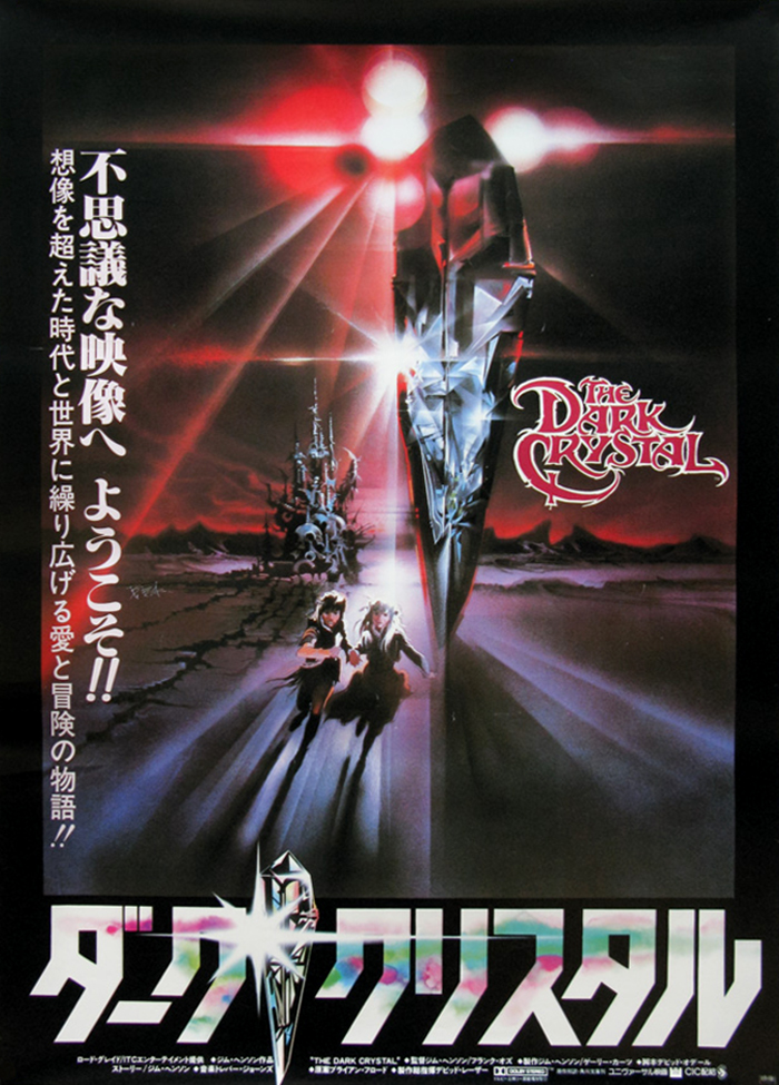
Peak has created artwork for a number of famous films including West Side Story, My Fair Lady, Exclaibur, and Rollerball, but the films that he worked on that really stand out as classic film posters are the first Superman, The Star Trek films, and Apocalypse Now. I really enjoy this painting he created for the Japanese market as it’s so weird and striking. I’m wondering if he also designed the Japanese logo as it looks to be in his style as well?
As far as Europe was concerned, there seemed to be a push to utilize the same artwork for most of those countries. The piece was painted by B. Napoli and was used in the United Kingdon, Spain, Italy, France and Germany. Let’s start with the poster from the United Kingdom…
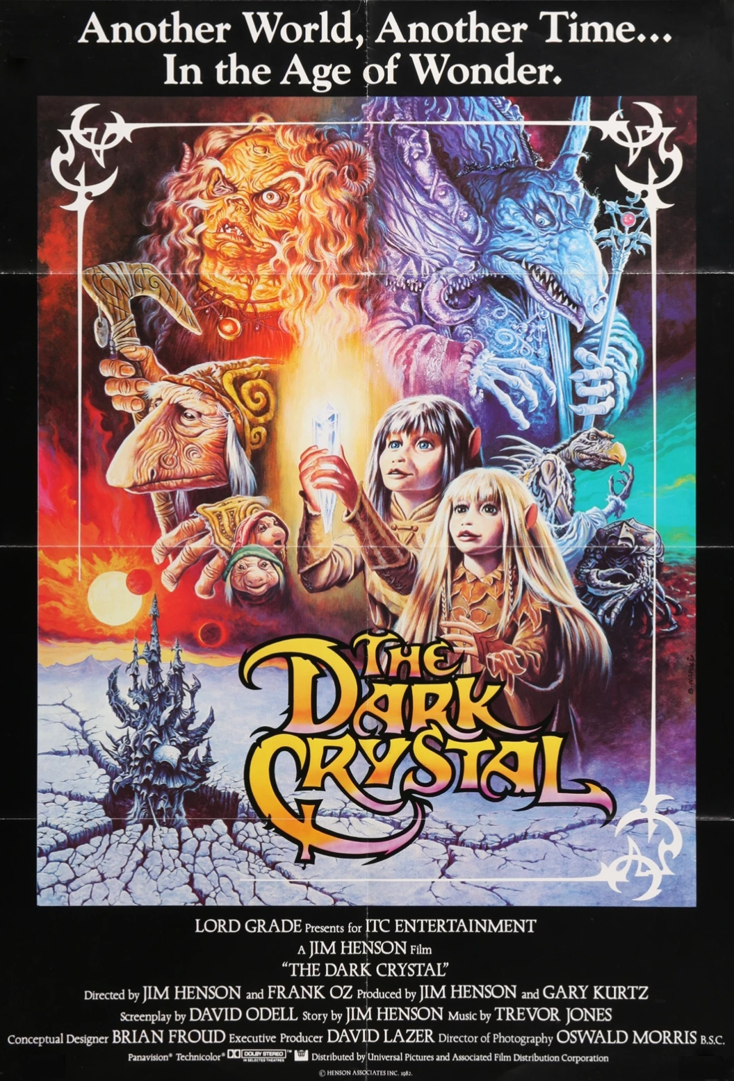
I’m kind of curious about B. Napoli as I wasn’t about to find much of anything online about the artist. At first I thought that maybe it was just a notation on the Italian version of this poster, but I was able to find some other film poster paintings all in the same style and signed “B. Napoli” including ones for Clash of the Titans, Supergirl, and Trading Places, so I’m assuming it’s the artist (though it’s strange that they’re all Italian.)
I love this piece because it features the most characters (with the addition of the Garthim and the Garthim-Master, though it lacks Fizzgig like in the Amsel poster), and Napoli really played up the light versus dark, offsetting the warm colors of the heroes with the cold scheme of the villains. Though most instances of this painting are seen with the flat black background, there was at least one that placed it on a white one as in this poster from Italy…
Here’s the French version…
I found it a bit interesting that they kept the English logo for the Italian poster, especially considering that there are alternate logos for the German and Spanish posters.
This next piece is a poster that was used to promote the film in the UK in various forms, most notably for the Thorn/EMI home video release of the movie on VHS and Beta, but it was also used as the cover of the Japanese laserdisc release.
For the life of me I haven’t been about to identify the artist. Anyone out there have a clue?
Finally, here’s the last piece of poster artwork I know for the film. It was painted by Joann Daley, but it appears that it was never used to actually promote the film.
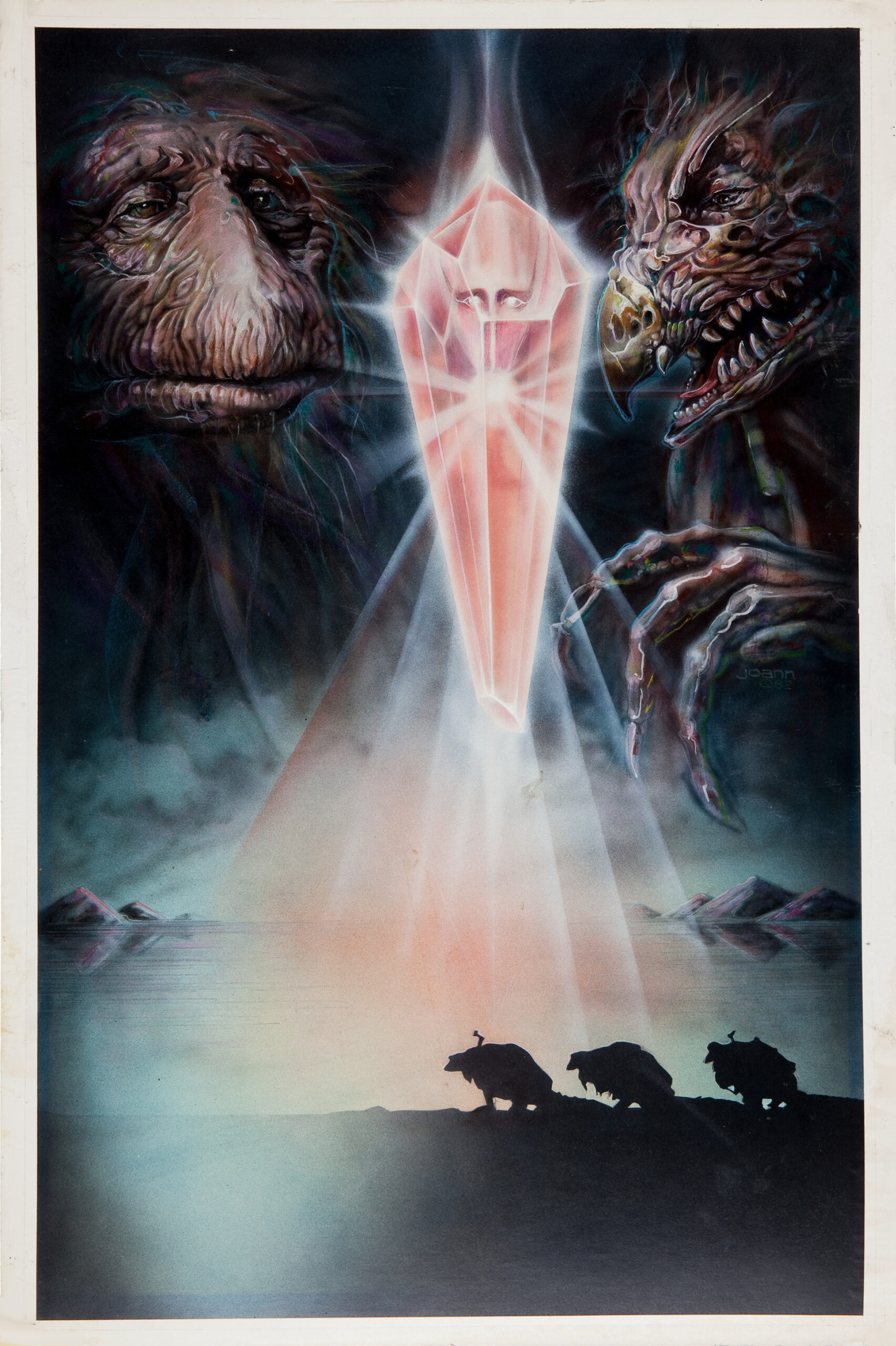
Daley is another renowned film artist who worked on a lot of iconic and memorable movie posters including the one-sheets for Creepshow, Scanners, the Invitation, Savage Streets, as well as a very different take on a piece for Friday the 13th. The one thing I absolutely adore about this piece is that it features a spoiler-ish image of an Ur-Skek at the heart of the Crystal of Truth.
So, does anyone know of any other Dark Crystal posters?


