Film posters have gone though a lot of permutations over the years and there are certainly some peaks and valleys when it comes to creativity and quality. For our money, the best era for movie posters started in the late 60s and carried forward into the late 80s. During this time painted or illustrated posters were at their peak and by and large most were very creative or at least fun. But sometime after the consumerist heyday of the 80s the movie industry, or at least those in the marketing departments, decided to edge out artists and traditional paintings in favor of photography, collage and mostly simplistic layouts.
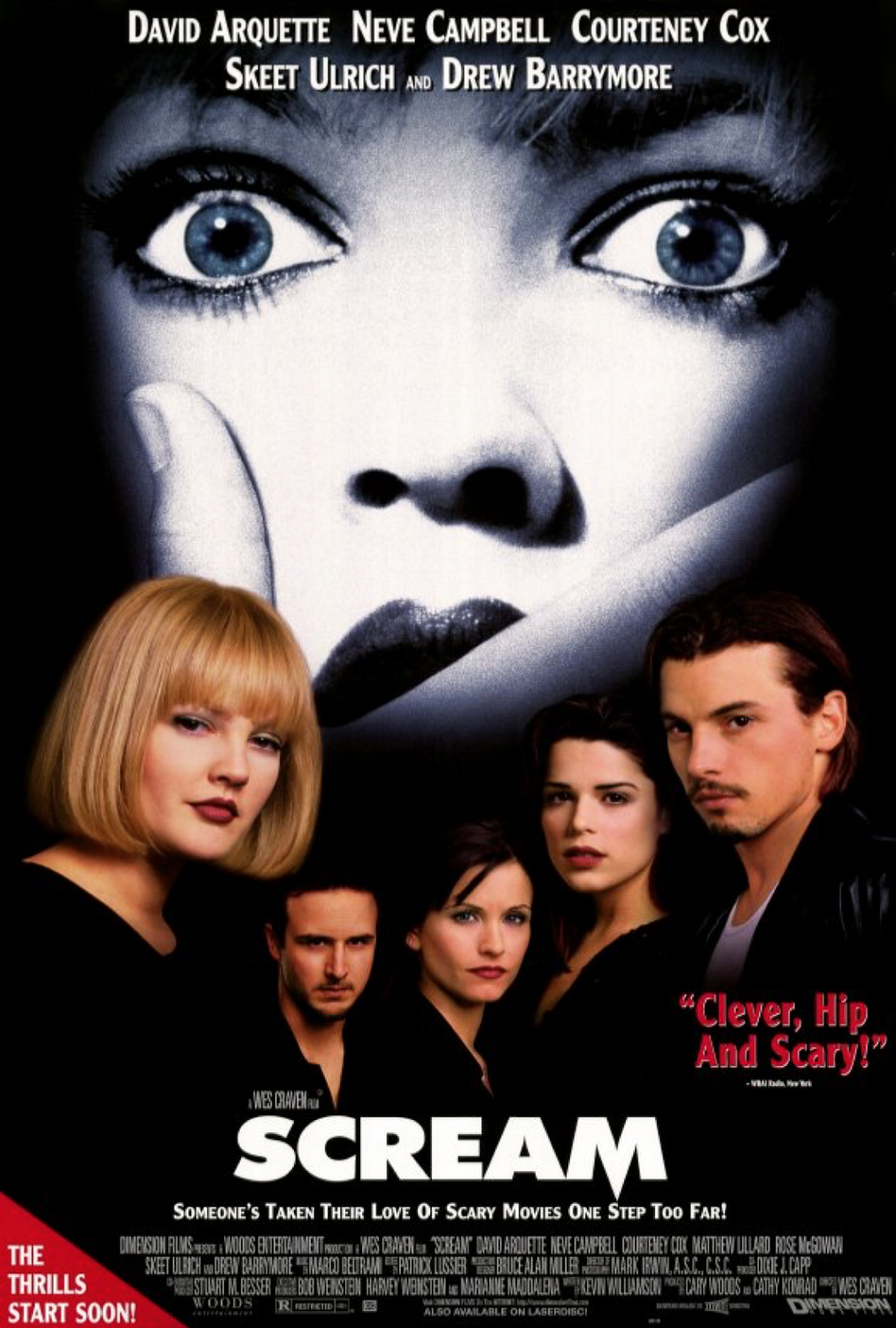
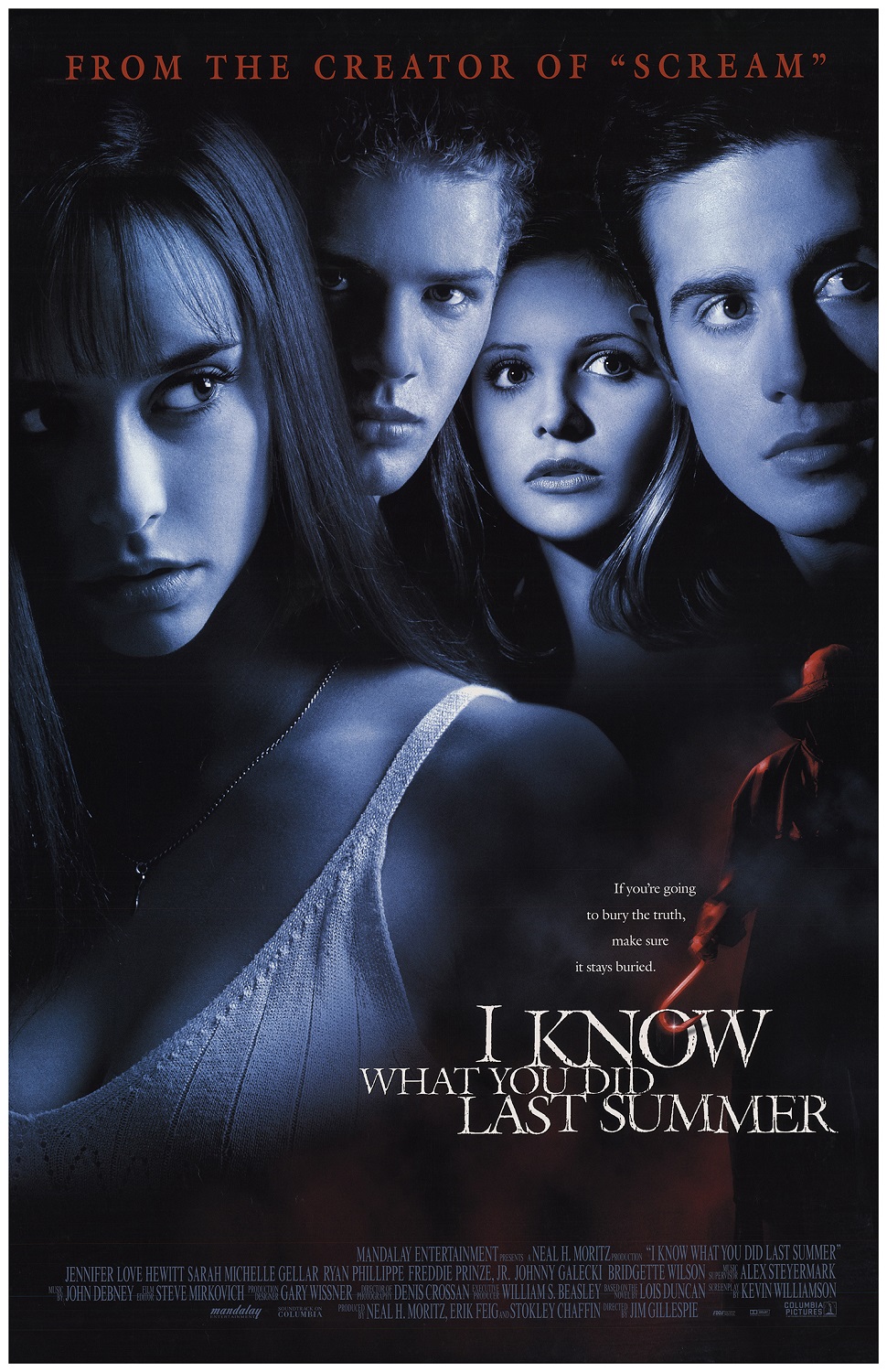
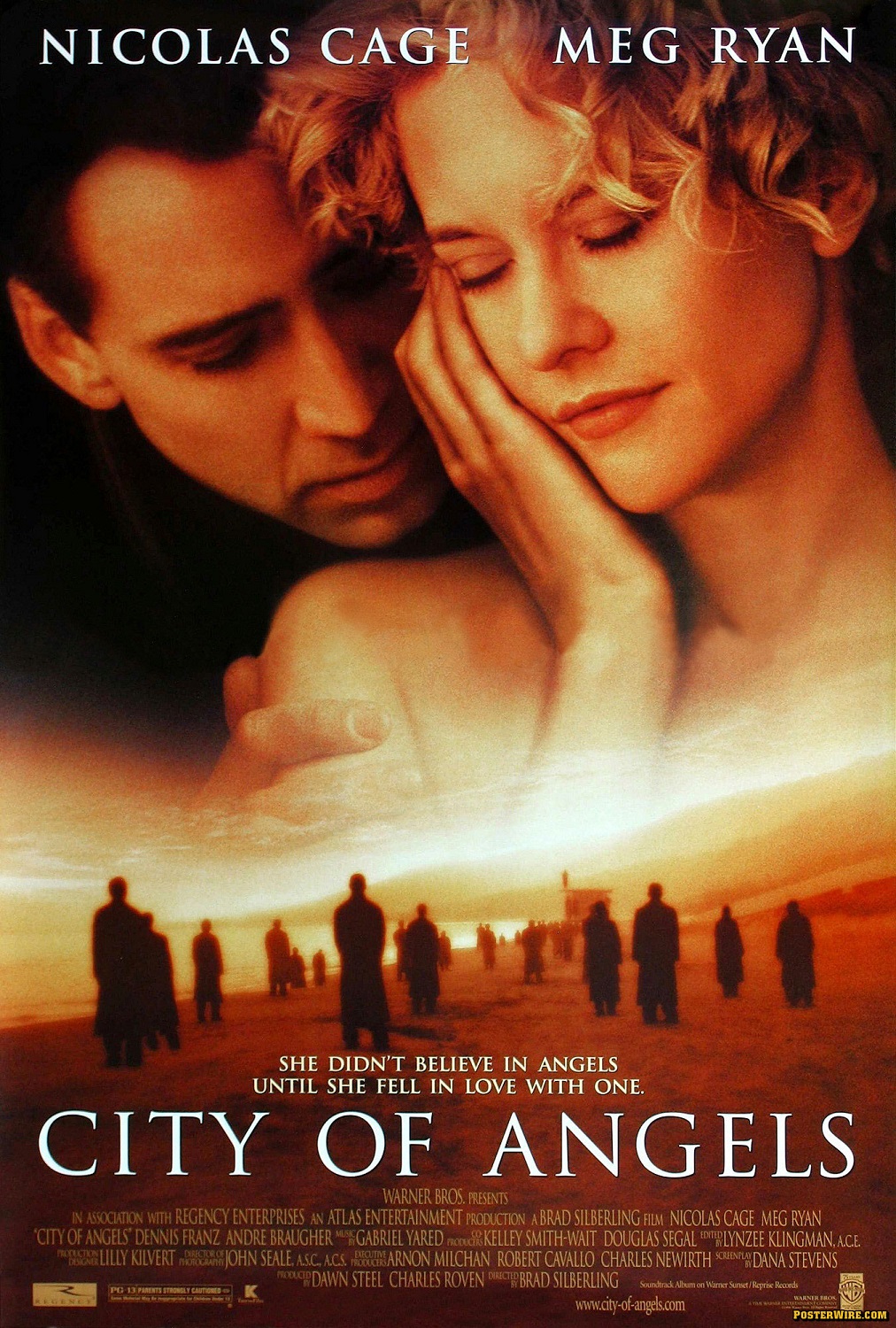
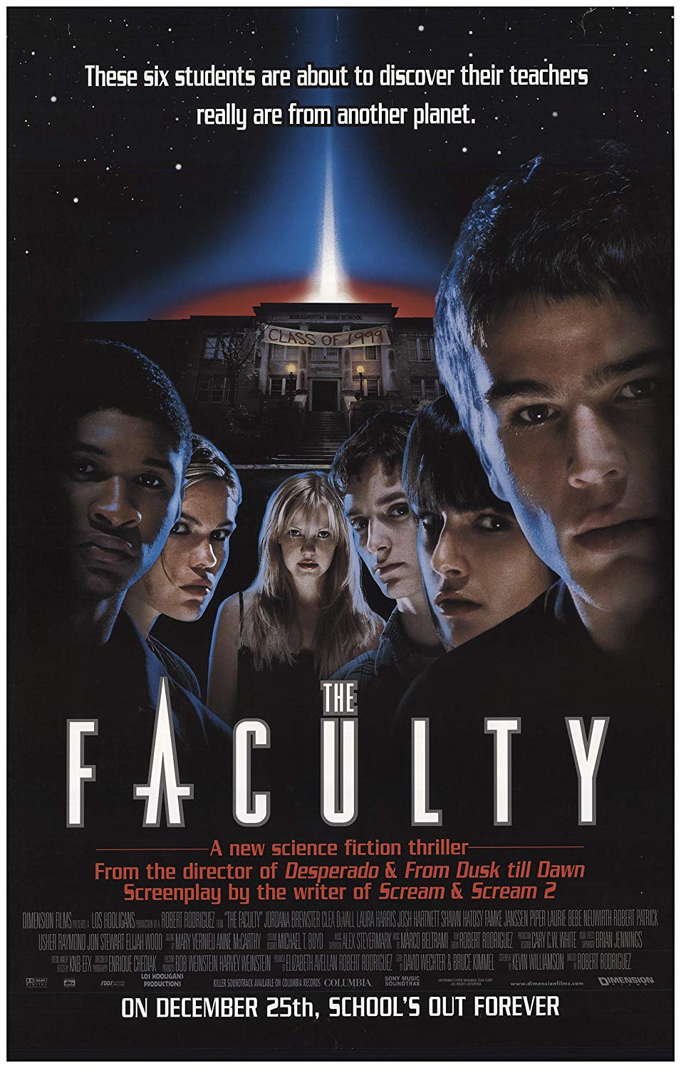
When From Dusk Till Dawn was released in 1996 the film poster industry was in the middle of a horrible trend of floating portraits. I mean just take a look at these posters for Scream, I know Why You Did Last Summer, City of Angels and The Faculty.
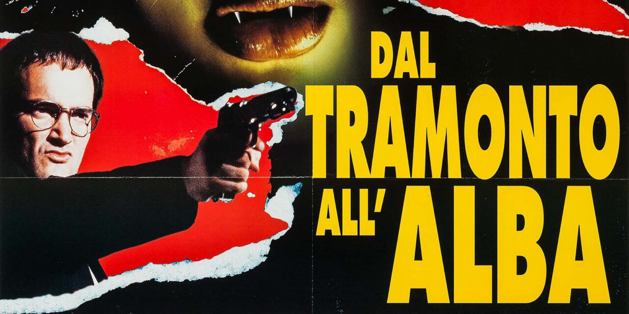
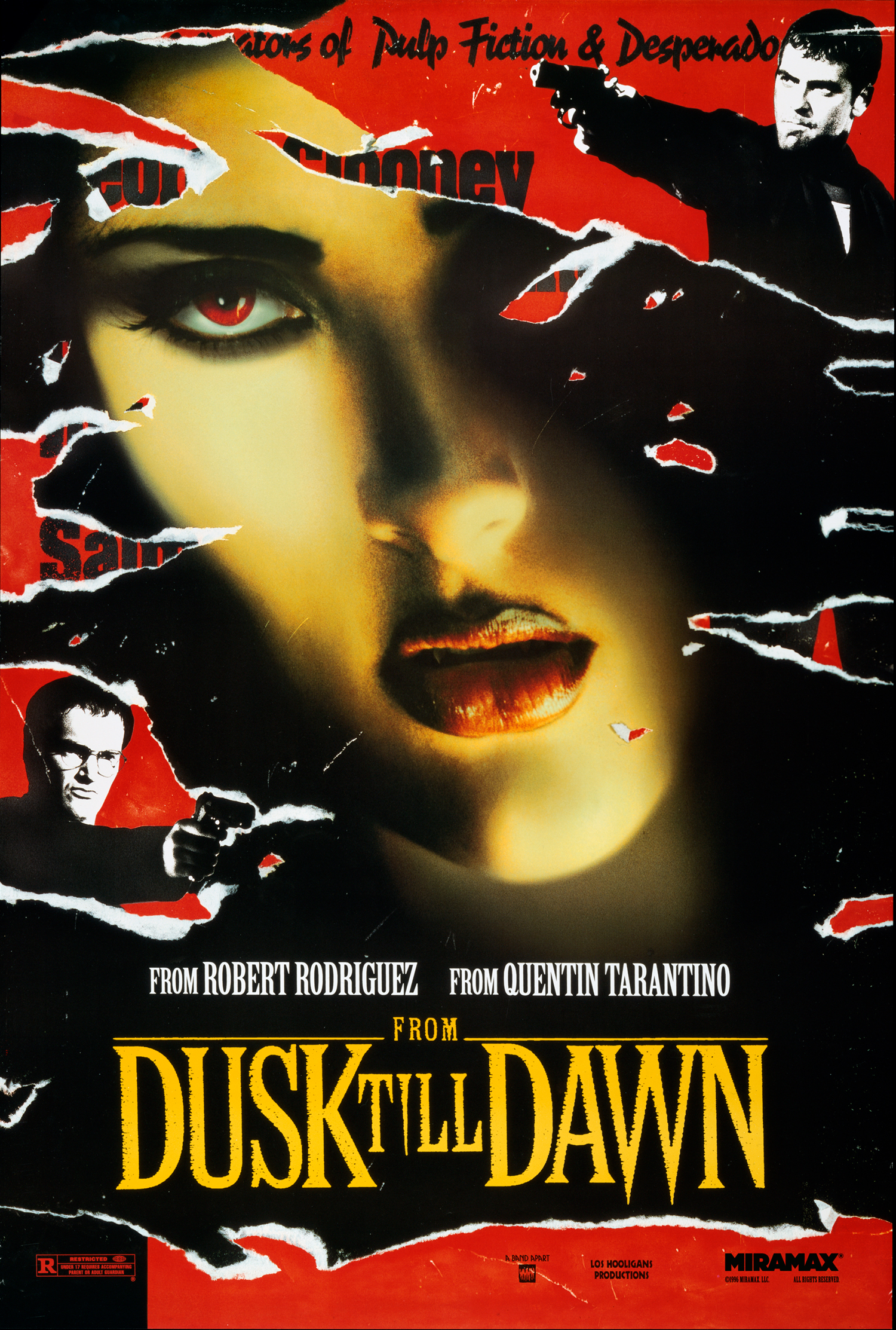
So it should come as no shock that the US theatrical poster for From Dusk Till Dawn followed suit. I had this poster on my apartment wall for two years and spent and awful lot of time scrutinizing it. Now, I’m not sure if this is a popular opinion in the Cult Film Club, but I think the poster is kind of fugly. In fact, it’s downright awkward…
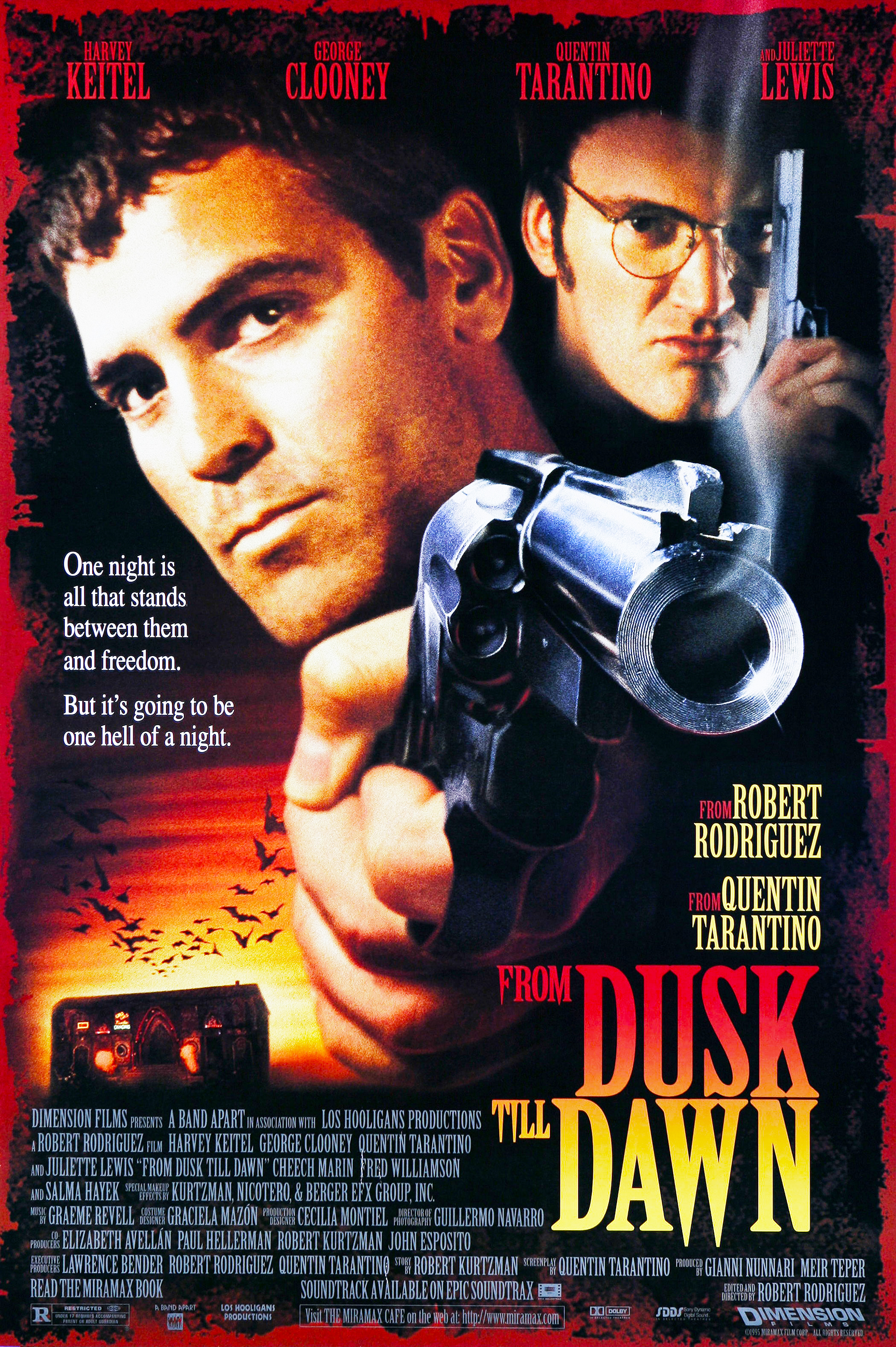
I mean, what the hell was the designer thinking when it came to this piece? Let’s break this down. The completely unnecessary blood-worn border is an effect that is 100% undermined by the crisp clean block of filmmaker text at the bottom that overlaps the effect. It’s also extremely busy when added to the shitty Photoshop texture laying underneath the title and filmmakers text at the bottom of the poster as well. Speaking of the title, it is way too small and shoved down into the bottom right, fully away from where the eye naturally moves around the image. It also has an unfortunate font that doesn’t reflect the logo used in the actual film. This is my own personal bias, but I feel like there should be a tonal alignment of fonts used in both the marketing and on screen. I understand that to achieve that, two separate departments have to be on the same page, but it shouldn’t be that hard. Also, the gradient effect that is trying to be clever by layering on the dusk and dawn sky light over the title is just bad. That’s not even bringing up the fang points on the random letters (I say random because by all accounts the bottom of the “N” should have also had a fang.) Between the color and the fangs, the design is just too damn “on the nose”. It’s trying to hard.
Honestly, there’s just too much text on this poster to begin with. Tarantino’s name alone is rendered five times on this thing for crying out loud (two very large, one in the header and the other above the title), and that’s not even considering that he also has a portrait that takes up 15% of the image space. The giant, neon Titty Twister sign is missing from the bar, so why even bother to try and squeeze this onto the poster at all? And Jiminy Crickets, can we talk about how awkward and silly Seth’s giant hand with the gun is? The pistol is at an odd angle, yet the opening to the barrel is a perfect circle. And seriously, it really is at such an odd angle and perspective to Seth’s head that it breaks the “3D/coming at you” intent of the design and just look like his arm is bent in a very weird way off-frame. The coup de gras is the smoke rising from the barrel of the gun that is laying under the “And Juliette Lewis” text, yet over the blood border.
I have never wanted to punch a movie poster quite as much as this one, and it’s not even the worst poster I’ve ever seen, that award goes to this beauty.
So there has to be better posters for this movie, right? The answer is yes, though barely. Let’s take a look at some of the other posters for this film, most from international markets. First up,a slightly better version of the US poster that was altered for the film’s release in Germany…
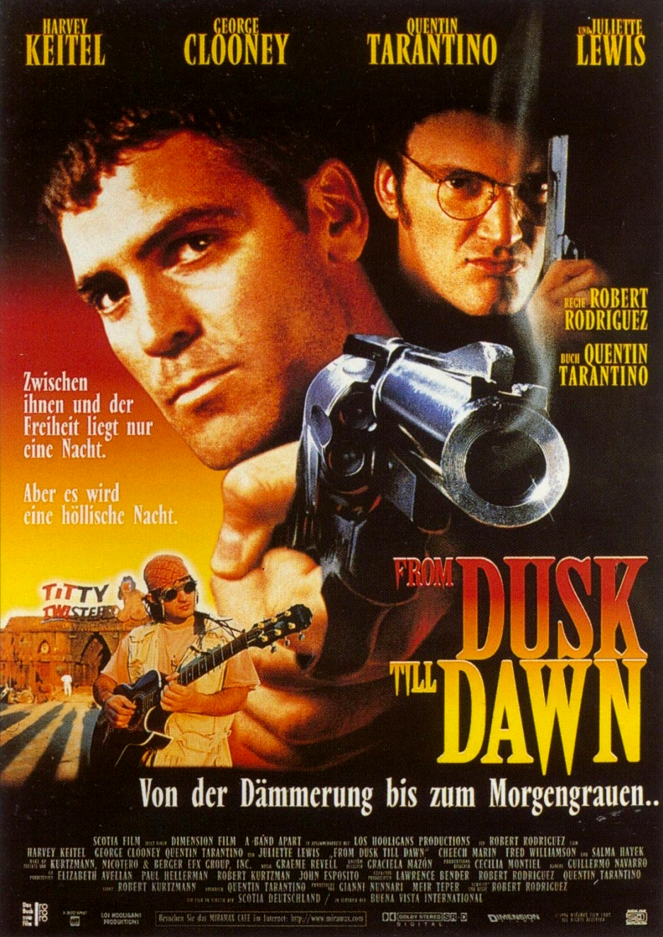
This version features a lot of the same issues, but there are also a few subtle changes that make it look a lot better. First, they ditched the whole faux blood and texture shtick, which makes the poster look much cleaner. Second, they overlaid a production still of Robert Rodriguez on set in front of the full Titty Twister that I think is really cool (how often in non-Alfred Hitchcock movies do you ever see the director on the poster?!?) Last, there is an over all color scheme to this one that just works better. Sure, the hand is still awkward, etc., but this version is way better than the US version.
Next, let’s scope my favorite alternate poster that hails from Italy…
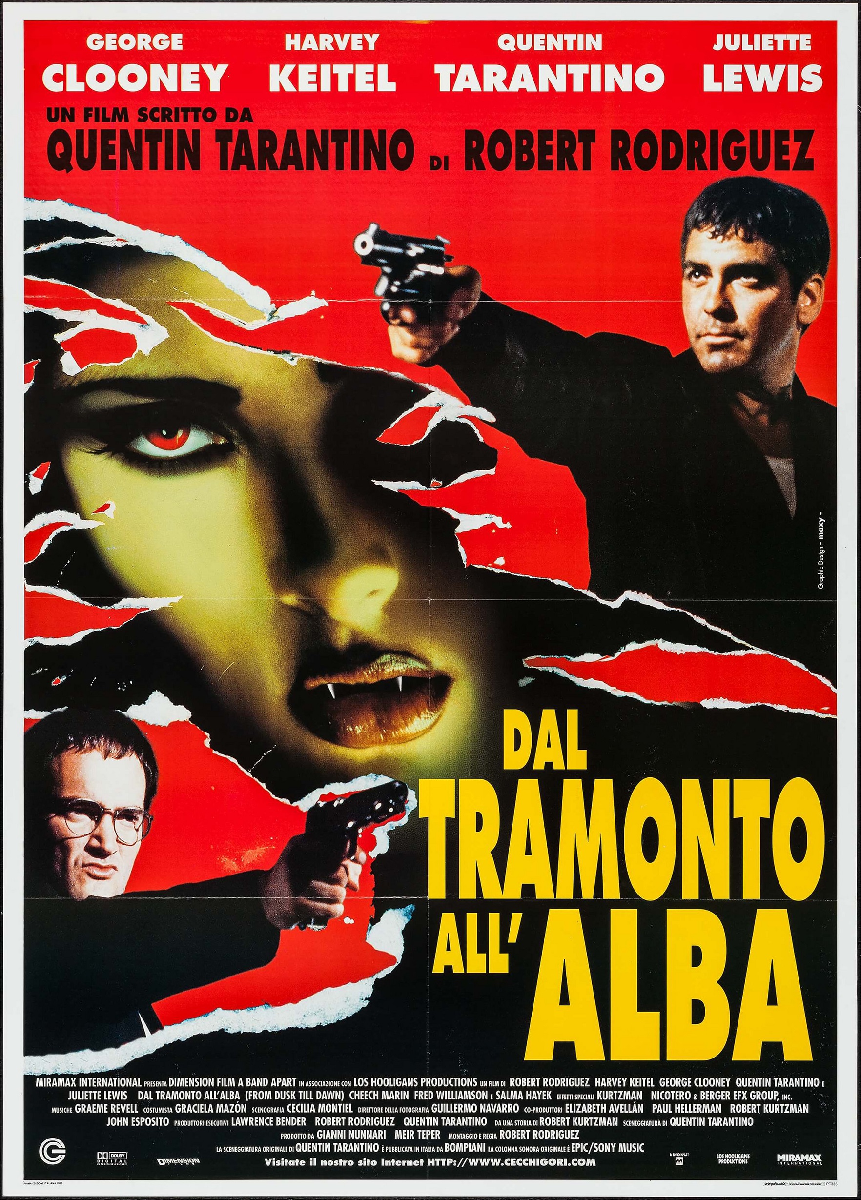
The reason I love this poster hinges on the fact that the designer (or design firm) that goes by Maxy (Mira-maxy?) replicates much of the element placement and tone of the US poster. The title is on the bottom right, there are faux vintage effects, Tarantino’s name still spears five times and there is still a lot of text overall, but in this piece it all works. The effects don’t awkwardly overlap text, the title, though small, comes across as really body by having it with yellow text over a black background, and the overall flow of the piece is on-point. I dig the torn paper effect way more than the vintage blood of the US piece as well. I love that the poster on top of Santanico Pandemonium covers the image of Seth and Richie, playing off of the dual nature of the two halves of the film too. Just a great piece, and I’m pretty sure that if someone at Miramax/Dimension didn’t create it themselves, they surely also loved it and aped the design for the US DVD, published screenplay and Soundtrack releases of the film as you can see in the variation below.
Santanico Pandemonium’s fangs are a bit too obscured, but otherwise this is a vast improvement from the original poster. I’m not in love with the font choice for this version, but it’s better than the original.
So let’s ride this FDTD poster peak back down into another valley with this UK quad poster…
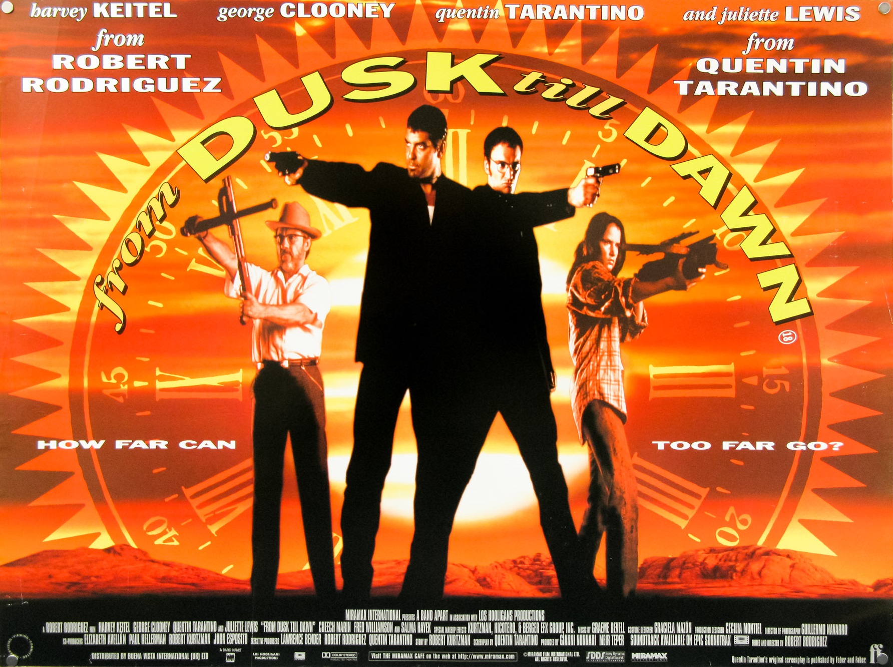
Though it’s not guilty of the floating head trend, this poster is one hell of an eye sore. I mean, holy shit, who thought it was a good idea to get so damn literal with the title in the design? That clock face graphic, which should be standing in for an actual sun, but it actually superimposed OVER and actual sun is disgusting. The film title hiding along the edge of that clock face is atrocious too.
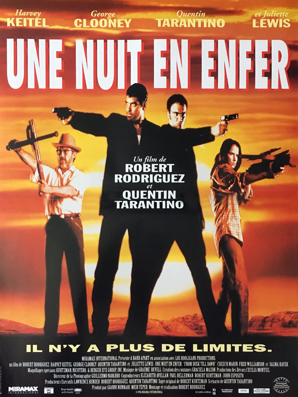
Want to see this image 50% less terrible? Yeah? Then let’s take a look at the Belgian poster for the film…
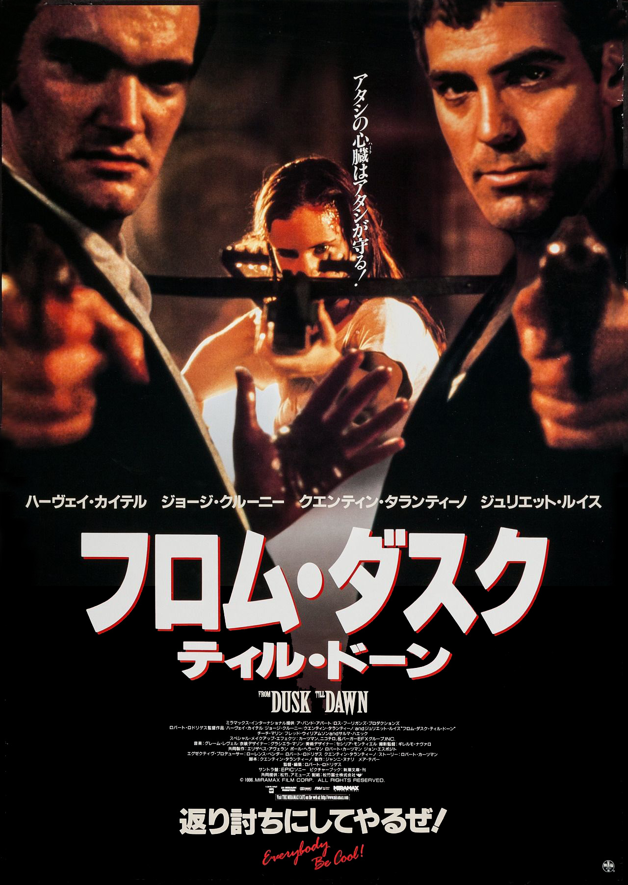
It would be criminal to end on less than awesome posters, so lets instead end on a couple of Japanese posters that are better than the UK and Belgian posters, but not quite as cool as the Italian one.

First up are a set of Japanese posters that fit side by side to form one larger quad poster. Though Tarantino is a little too front and center on these pieces, it’s totally understandable considering he’s just won the Oscar for screenwriting and all. Also, it features one of the most underused and effective images in the film with half-vamped Richie that I love. I wish that I read kanji because I can tell that the taglines on the posters are different, as well as the text at the top. Anyone know the translations?
This last Japanese poster is pretty straight forward, but it’s still better and most of the others. I really love the “Everybody Be Cool!” bit at the bottom too.
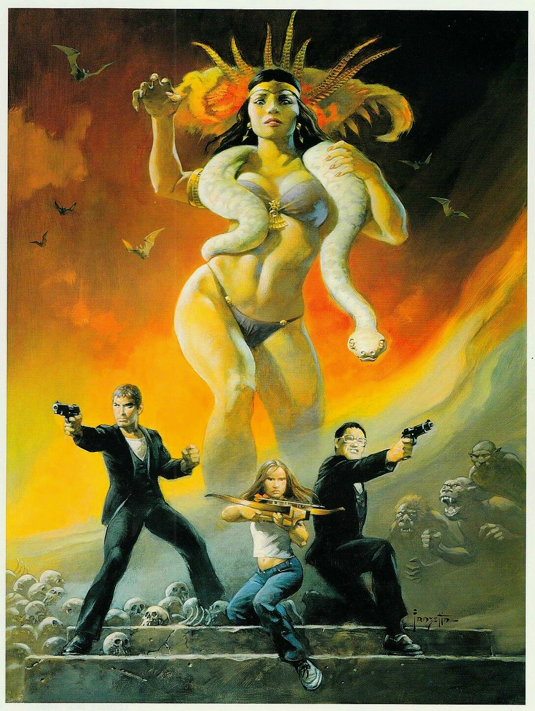
The final image I want to leave you with was never an official theatrical poster (it was commissioned to be one, but wasn’t finished in time), but it is one of the coolest pieces of From Dusk Till Dawn artwork that I’ve ever seen. It’s a painting by the late great Frank Frazetta and it should one day be used as the cover to a Criterion edition of the film…


