Here at the Cult Film Club we love seeking out all of the ephemera related to the films we cover, and none more than than the various one-sheet and international posters. Sometimes there isn’t a lot of variation in the marketing of the films around the world (as was the case with a movie like The Crush), but a lot of the time there is all kinds of fun variant designs and interesting imagery. For the 1992 flick Freejack there was a lot of variation and we wanted to take a minute and share what we found while researching the film.
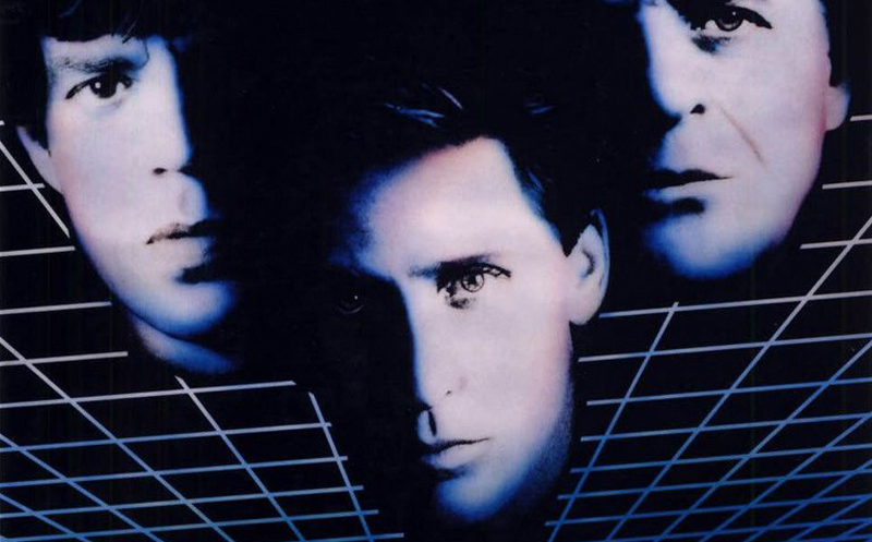
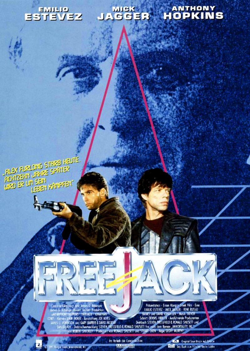
First off, let’s start with the original United States one-sheet for the film. Though it’s an early example of the dreaded “floating head” designs that would overtake the 90s movie poster world, we still dig this poster because it was before the trend became overbearing and ridiculous. The one thing that is a bit of a weird thing is how prominently Anthony Hopkins is featured in this design. Sure, he was fresh off of his Oscar win for Silence of the Lambs and certainly earned the third billing behind Mick Jagger and Emilio Estevez, plot-wise his character should be more of a mystery. Personally I think the design would have been better served with Rene Russo in the top right of the poster. Another example of Hollywood politics getting in the way of good marketing and art.
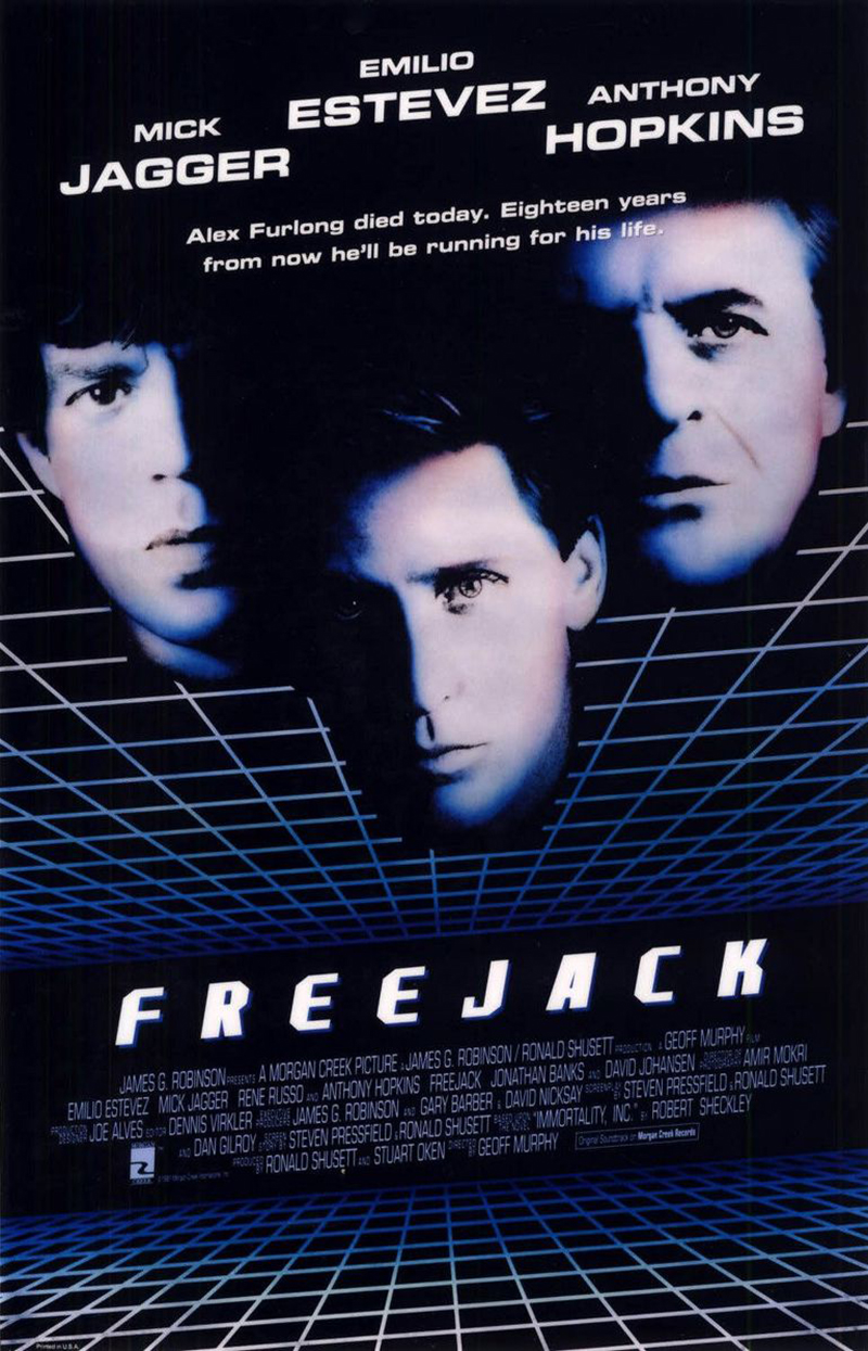
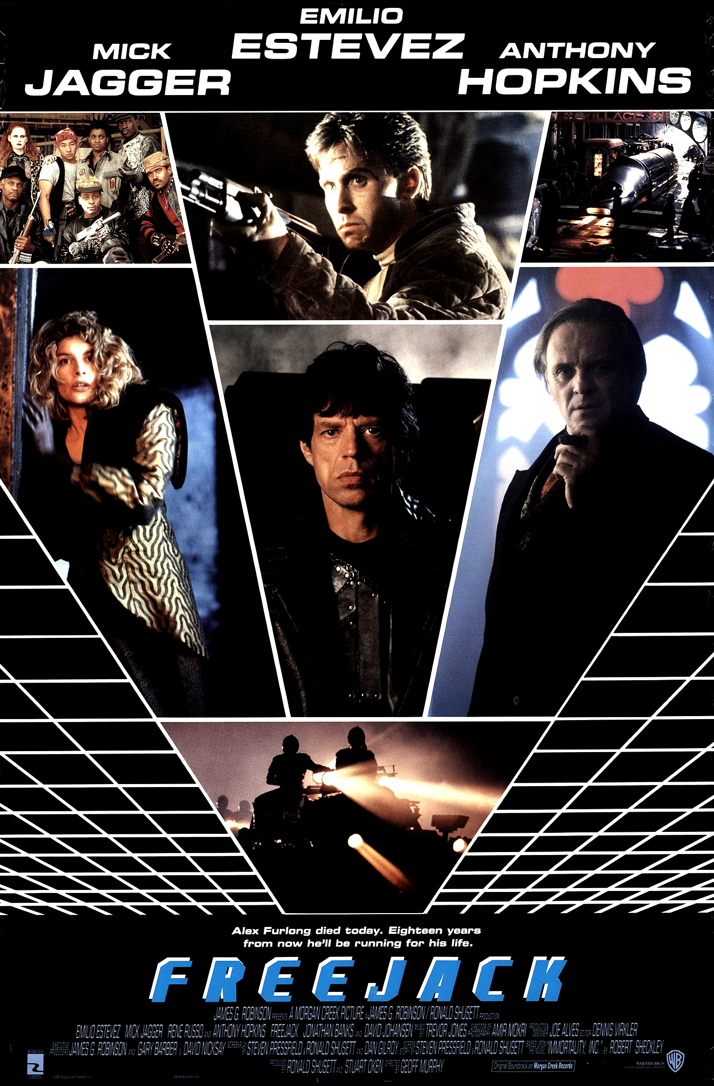
Though the film was not the hit that the studio was hoping for, you can clearly see that they really did have higher hopes as this poster was released in two formats, your standard paper one-sheet and a special foil embossed version that was used for promotion outside of the movie theaters (I believe a lot of these ended up at conventions and in places like comic book shops.) It’s kind of hard to get a good scan of the foil effect, but you can get an idea from the image on the left below. In addition to the standard design, there was also a secondary design that would mimic the eventual home video release of the film. This one at least features Russo in a prominent section of the design and it has a slightly more “sci-fi” feel to it.
Let’s jump on over to Germany and take a loot at the one-sheet that was released over there. This is probably one of our favorite poster designs of the bunch, partly because it has a rad steel 3D variation of the film logo, but also because they utilize Hopkins in a way better way when you consider the plot. Having him murky and in the background is very fitting for the story.
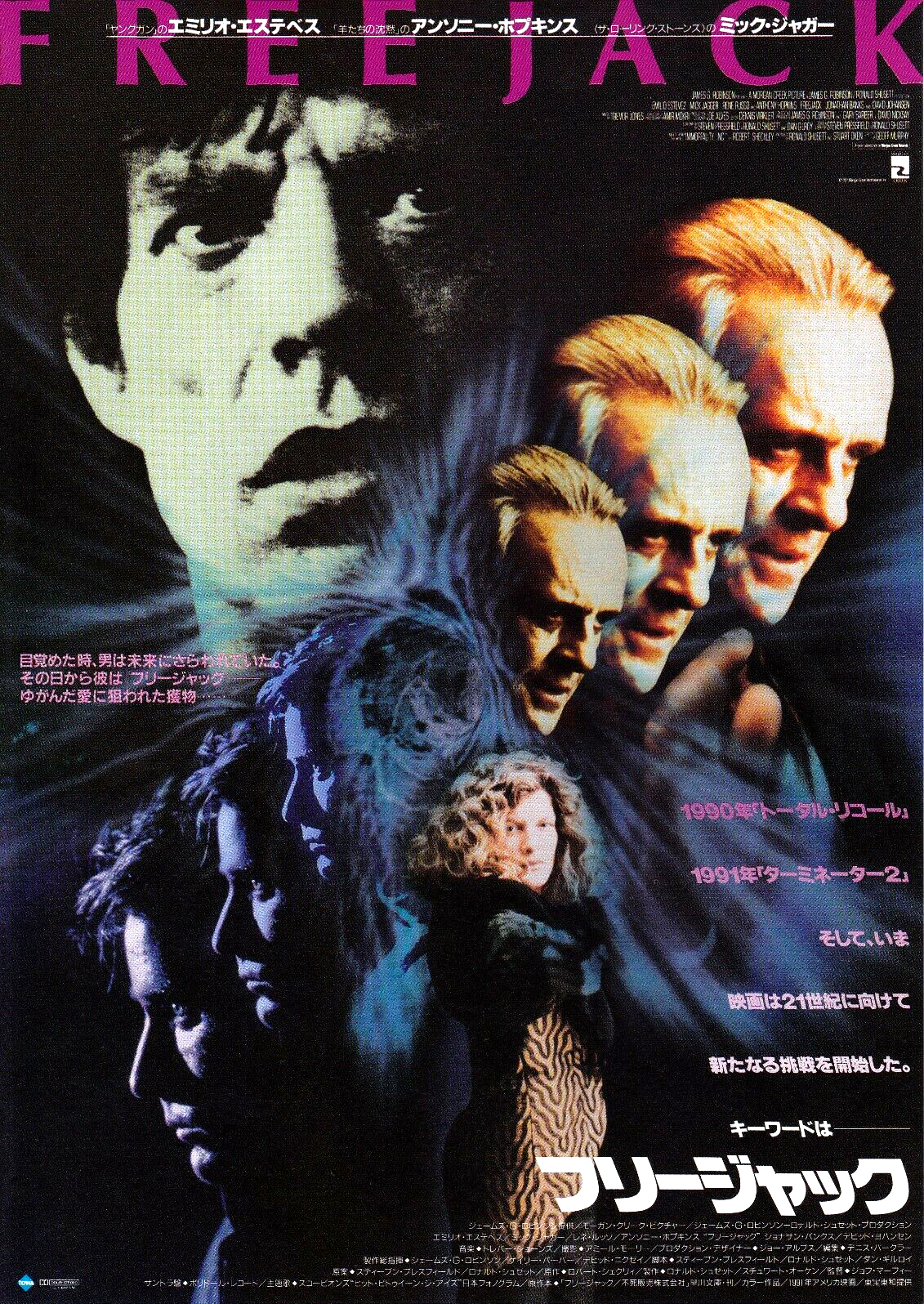
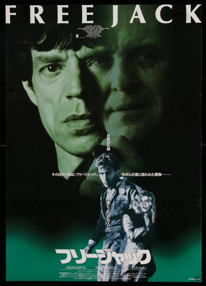
Let’s now jet on over to Japan where the film had two variations of posters, both very different from the US iterations.
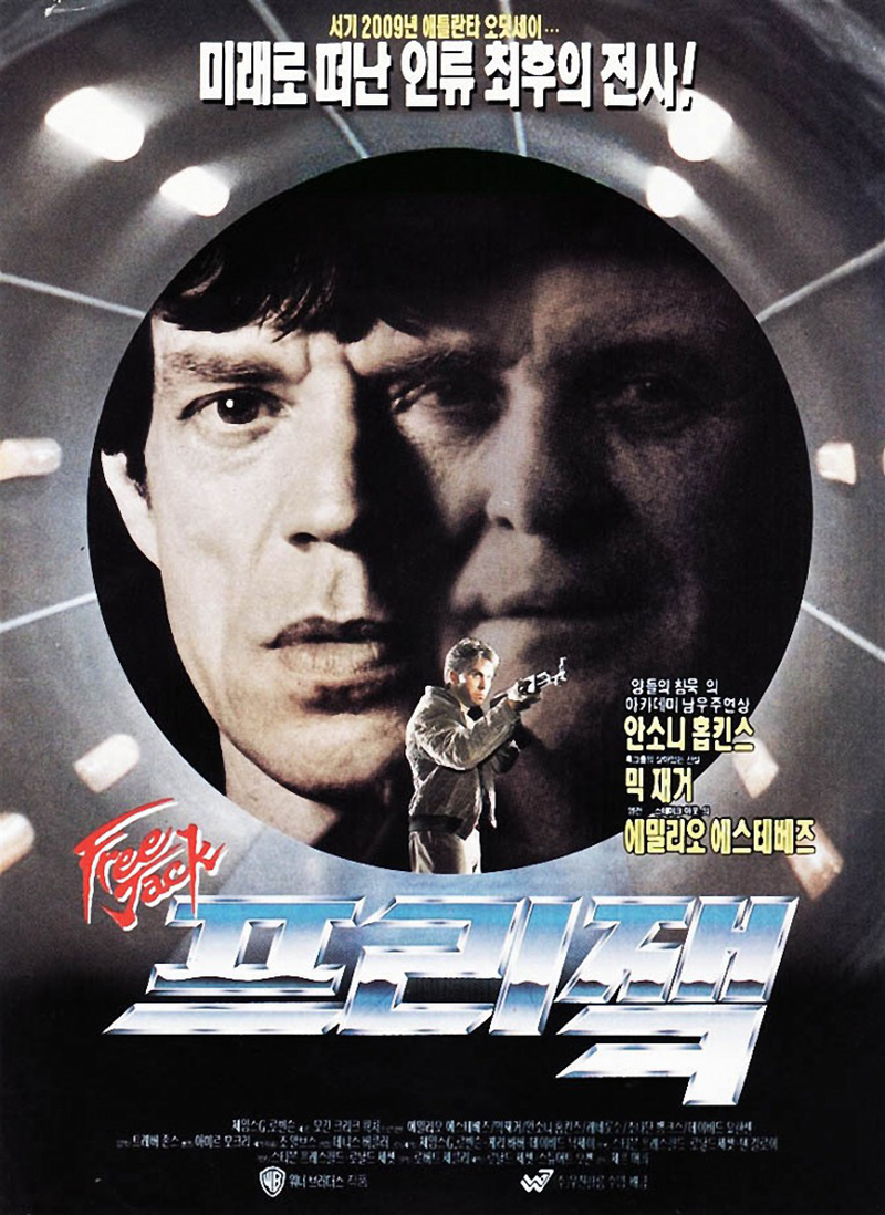
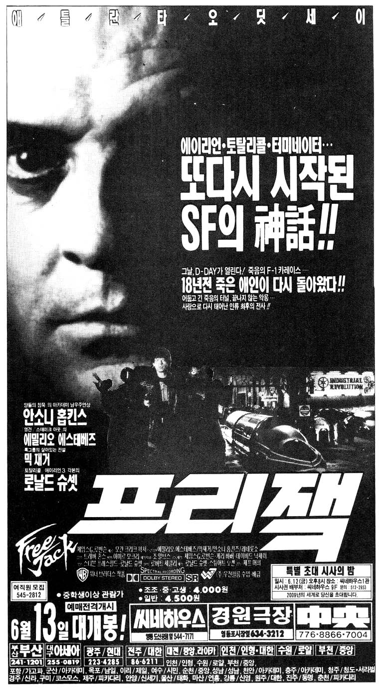
Next we have this poster from South Korea. I love that the logo has both the Korean language and English variations….
Here’s an example of a Korean handbill, the flyers handed out at movie theaters to entice viewers to see the flick…
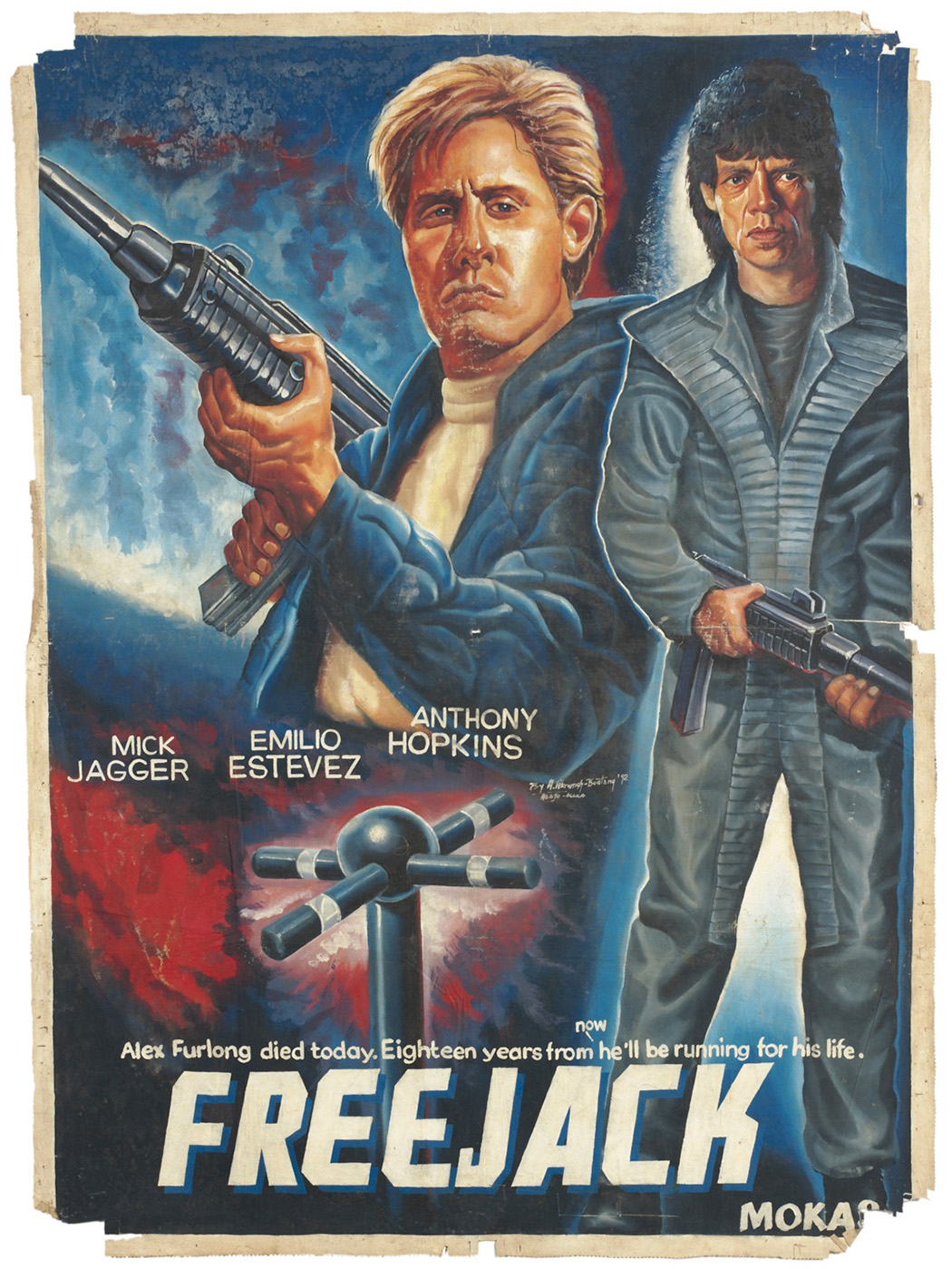
And last, but certainly not least is this amazing poster from Ghana in Africa. This is actually a surprisingly accurate depiction of the film. Typically these posters are pretty bat-shit crazy, but this one works quite well.


